
 Русский
| Shows & Events |
| Pictures of cats |
| Posters |
| Editorial Cartoons |
| Little Observations |
| Travel Stories |
Any Water on Mars? Cats are afraid of water. Everyone knows it. And cats as well. The thing is that when a cat is wet everyone can see that it is not round and fluffy but very-very thin. Until the fur becomes dry. And Cats feel VERY shy about that. Cats were looking for a place where ... more Cats are afraid of water. Everyone knows it. And cats as well. The thing is that when a cat is wet everyone can see that it is not round and fluffy but very-very thin. Until the fur becomes dry. And Cats feel VERY shy about that. Cats were looking for a place where ... more |
Would you like to receive new pictures?
My Family and Other Letters An essay about how letters have shaped three generations of my family.

To be honest, I have never thought of type as a discipline in its own right. To me, a typeface is simply another creative tool—a pencil, a canvas, a computer, a lump of clay, or even a sense of humor.
Only recently have I begun to realize that this attitude didn't emerge by chance. In one way or another, everyone in my family has expressed themselves through type, letters, words, and the ideas they carry.
1. My Father — Vladimir Stelmashonok
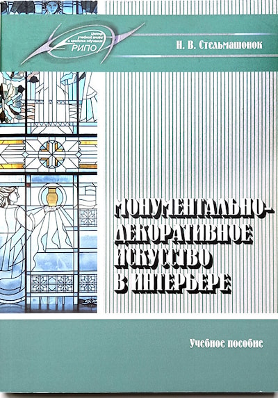
I probably inherited this way of thinking from my father. Throughout his career as a painter and monumental artist, letters were never merely captions or inscriptions. He often stylized and ornamented them so boldly that they became an inseparable part of the artwork itself.
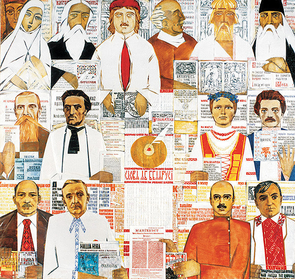
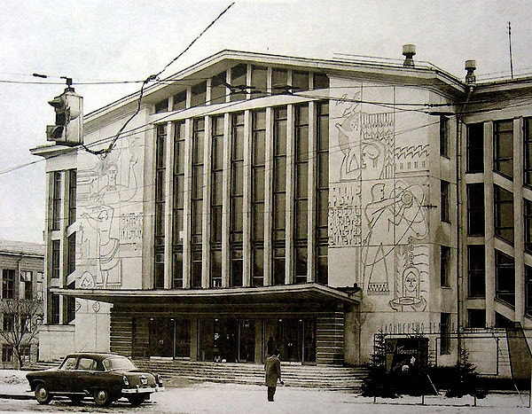
Perhaps the best-known example is his painting Words about Belarus (Slovy ab Belarusi). Yet his very first experiment in weaving together imagery and letterforms was a monumental sgraffito created with the artist Gavriil Vashchenko for the façade of the House of Culture of the Minsk Worsted Textile Mill between 1962 and 1964.
Unfortunately, there's little point in rushing off to see it today.
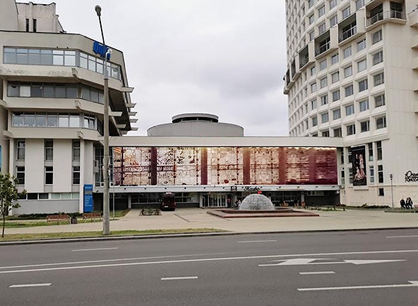
A few years ago, this remarkable work—created using a painstaking technique that demanded immense skill, physical endurance, and was intended to survive for centuries—was simply buried beneath a thick layer of plaster. The reason? Someone in the building's management decided it looked "outdated."

The act sparked a wave of public outrage online, but sadly even that was not enough to stop the vandals.
Nor was this the only one of my father's monumental works to be senselessly destroyed.
Take, for example, the colossal stained-glass composition Celebration of the Belarusian Land, created with Valery Dovgalo for the lobby of the National School of Beauty in the early 1980s. Covering an astonishing 250 square metres, it would have deserved a place in the Guinness Book of Records and was almost certainly the largest stained-glass artwork of its time in Europe—certainly in the Soviet Union.
The window combined four different kinds of glass—coloured, cast, frosted, and textured—together with hand-painted details. The entire structure was assembled in aluminium using traditional lead cames, a technique whose craftsmanship is rarely encountered today.
Exterior view of the stained-glass window (digital reconstruction).


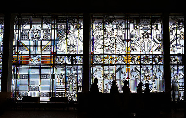
The story of its destruction unfolded slowly.
At first, the once spacious lobby was divided into a maze of tiny retail units. As new tenants moved in, pieces of coloured glass gradually disappeared from the artwork, broken off one fragment at a time. Then, in the early 2000s, a fire badly damaged what remained. The stained glass required careful restoration, but instead it was simply removed. The logic seemed to be: no stained glass, no problem.
I regret its loss not only because of its extraordinary scale, but also because it was one of the very few monumental projects on which I worked alongside my father as a type designer.
Each portrait in the vast stained-glass gallery of Belarusian scholars and educators was surrounded by a halo of names and quotations, all set in a redesigned version of Skaryna's historic typeface that I created specifically for the project.
Sadly, not even a single good photograph of those inscriptions has survived.
Works like this are no longer made. The painstaking stained-glass techniques that produced masterpieces throughout the Middle Ages—works intended to endure for centuries—have all but disappeared.

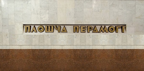
Fortunately, another of my typographic collaborations with my father has survived intact: the lettering for Victory Square Metro Station in Minsk.

As the basis for the design, I chose the Broadway typeface, substantially reinforcing its delicate strokes to suit the scale and durability required for architectural lettering. My original proposal also incorporated the motif of a ceremonial military ribbon into the station name.

The metro authorities, however, rejected that version, and the station was ultimately fitted with the simpler polished letterforms that remain in place today.
*****
2. My Mother — Irina Vasilyevna
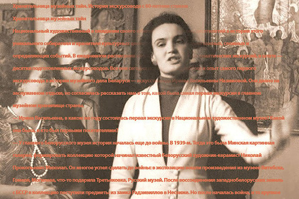
My mother, Irina Vasilyevna Nazimova, was a remarkable art historian. But beyond her professional knowledge, she possessed another gift: she knew how to arrange letters into words, words into sentences, and sentences into stories with remarkable grace.
If I have inherited a love of storytelling—including writing books such as The Tales of an Old Smartphone—it is entirely thanks to her.
*****
3. My Sister — Natasha
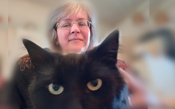
I have long been convinced that my sister Natasha could master just about any profession she chose. Give her a little time, and she will acquire genuine professional skill—whether in art history, pet grooming, ceramics of every imaginable kind, classical dressage (she even graduated with honours!), creating models for holography, or countless other pursuits.
Her boundless curiosity has led her into the most unexpected projects and the company of extraordinary people. One day she may be helping to restore a historic Catholic church; another, she may be translating my fairy tales into Belarusian.
Whatever she happens to be doing, Natasha always has kind words to offer—and especially so when animals are involved.
*****
4. My Own Handwriting — or, The Story of Hairlines
Now it's my turn.
My first encounter with the demand for beautiful lettering came in the autumn of 1963, when I entered the first grade at School No. 90.
Trying to imitate the elegant cursive models in our copybooks turned out to be sheer torture. No matter how hard I tried, neat handwriting simply refused to happen. Every attempt to reproduce the officially approved Soviet penmanship model of 1947—with its graceful contrast between heavy downstrokes and delicate hairlines—ended in disaster.
Press a little too hard, and the steel nib punched straight through the paper. Ease up to draw a fine hairline, and the nib would catch on the rough surface, splattering tiny violet droplets of ink across the page. Sometimes it even tore fibres from the paper itself, turning the pointed nib into something more like a broad-edged pen, producing clumsy strokes well over a millimetre thick.
The paper deserves a story of its own.
The glossy exercise books that made decent handwriting possible didn't find their way into my schoolbag until around 1964. And they certainly didn't appear as if by magic. In those days they were considered a luxury, usually brought back from Moscow, where they were scarcely easier to obtain. Long before opening time, enormous queues would form outside the famous Detsky Mir department store—the one place where hopeful parents might manage to buy these coveted school supplies.
So what did we write on before that?
The paper in ordinary school notebooks resembled modern multi-ply toilet paper. Dip a little star-shaped nib into the familiar glass inkwell, and the purple ink immediately spread in every direction. To be honest, those notebooks were really fit only for pencil work—perhaps for pressing leaves into the compulsory summer herbariums every primary school pupil was expected to collect.
By the time my long-running battle with school penmanship was over, one thing had become abundantly clear: I had acquired truly dreadful handwriting.
Then one day it occurred to me that perhaps this wasn't such a bad thing after all.
Instead of struggling for elegance, I began writing with energy and spontaneity, letting the letters flow almost carelessly and giving them a character of their own.
Something like this →


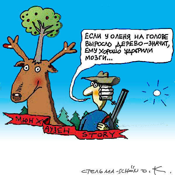
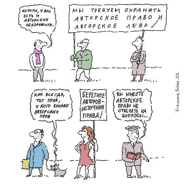
Fortunately, captions for humorous drawings and illustrations didn't require flawless calligraphy.
The next logical step was experimenting with handmade business cards, each one built around my delightfully crooked lettering.

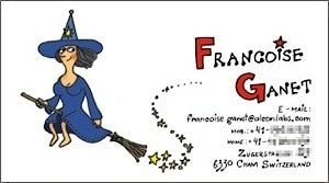
At the same time, those hand-drawn letterforms gradually evolved into logos and trademarks. I'm happy to say that many of both the logos—and their owners—are still going strong today..

Here's another example from that period: an exuberant, vinyl-inspired piece of crooked lettering that has somehow survived the passing of time.
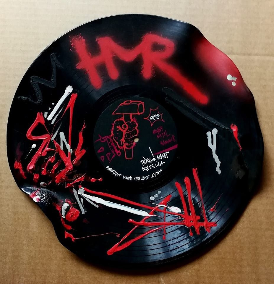
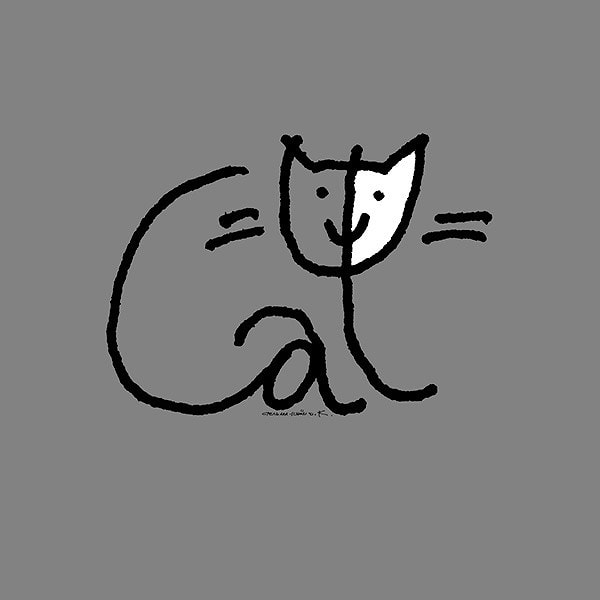
One of my favourite projects from those years was the Catphabet—an entire alphabet constructed from drawings of black cats.

And finally, it would have been rather odd not to use my peculiar lettering to design my own logo. So... here it is.

With that, let's leave the past behind and turn to the future.
*****
5. My Daughter — Sasha
If anyone in our family has been blessed with an extraordinary abundance of talent, it is my daughter, Alexandra.
Calligraphy in almost every imaginable form comes naturally to her. She works with finely pointed pens and hand-cut wooden tools, with gouache and flowing silver, with transparent resins and the deepest black ink. Her work ranges from logos, symbols, and illustrations to textbooks based on her own methods of teaching calligraphy, and to the creation of truly extraordinary handmade books.
And that's only the beginning.
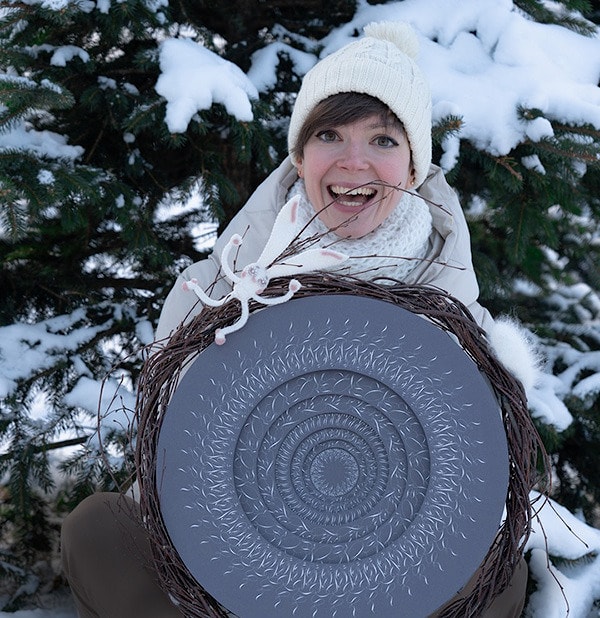
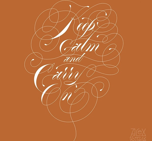
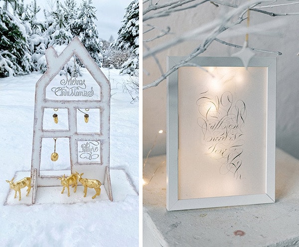
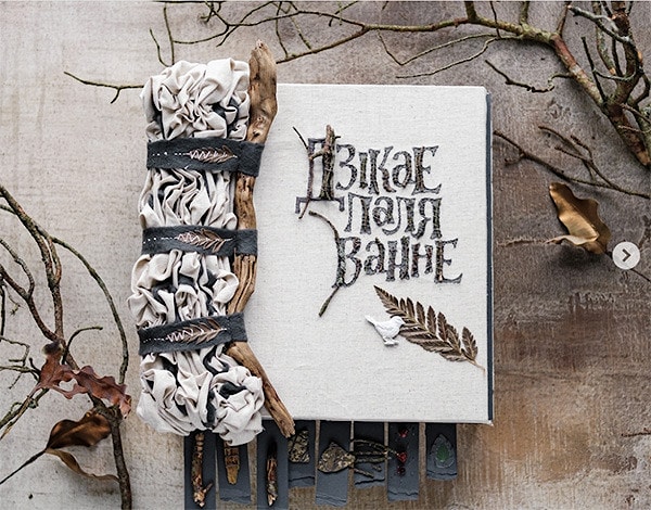
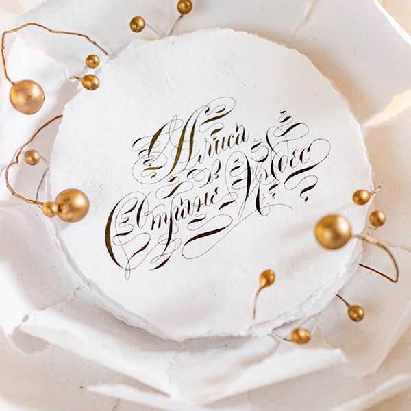
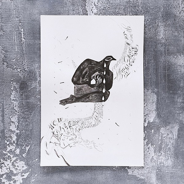
The images shown here represent just a tiny glimpse of Alexandra Stelmashonok's work. Her complete portfolio can be found here.
***

The site is powered by Nestorclub.com
Copyright © 2009-2026 Cats & Dreams. All rights reserved.